Who decided that pink is for girls and blue is for boys? This color-coded distinction is actually a fairly recent invention that dates back to the mid-20th century.
A century prior, pink and blue were just two of a handful of genderless colors. In fact, there was a time that the assignments were reversed.
Pink, technically a faded red, according to a 1918 trade publication is a “more decided and stronger color,” hence it should be worn by men. In her 2016 book “The Secret Lives of Colors,” journalist and author Kassia St. Clair notes that red is after all a color of power donned by most powerful figures, from soldiers to cardinals. Blue, on the other hand, is the Virgin Mary’s signature color, dainty and calm.

Fast forward to modern times when pink, believed to be named after the flower Dianthus plumarius, is reclaimed as an empowering, feminine, and queer color—notwithstanding a feminist backlash that argues that it infantilizes and sexualizes women’s bodies. (Also, don’t forget the capitalistic appropriation of this color, “pink tax,” which ramps up the prices of products marketed to women.)
We look at the origins of four distinct pinks—hard as they are to distinguish—based on St. Clair’s research. These pinks (Baker-Miller pink, fuchsia, shocking pink, and fluorescent pink) throughout history have come to define more than just women’s plight but also humans’ fixation on assigning meaning to things like, well, color.
Baker-Miller pink

Before women’s restrooms bore the distinct shade of pink, did you know that at one point in history jails were also painted this color?
Named after two officers at the U.S. Naval Correctional Center in Seattle, Washington, Baker-Miller pink was believed to tame delinquent prisoners. Based on experiments conducted in the ’70s, it was found that a ratio of one pint of semigloss red paint to a gallon of pure white paint on walls decreased the incidence of violence inside correctional facilities.
It would take another series of experiments conducted a decade later to debunk this, but how wonderful it was to think human tendencies and urges could be reduced to literally the color of their environment.
Fuchsia
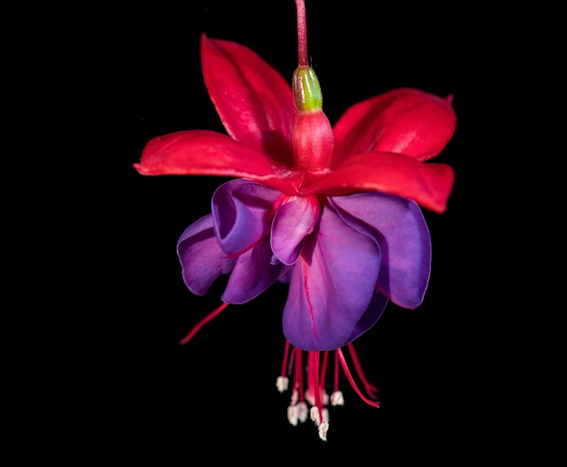
Just like its parent color, fuchsia is also named after a flower. That flower was named after a botanist because as St. Clair’s research proves, what is the study of color but mostly an accumulation of attempts in history to reproduce colors in nature.
German physician and botanist Leonhard Fuchs is revered in the field for trying to create a garden where all flora from all over the world is grown. Remember, this is pre-globalization. His illustrated book “De historia stirpium commentarii insignes (Notable Commentaries of the History of Plants),” published in 1542, successfully cataloged 400 wild and 100 cultivated species thanks to his garden.
Today, Fuchs’s flower is most notably remembered—or forgotten—because it is hard to spell.
Shocking pink
“Shocking” may be the last word one would use to describe the paleness of pink compared to red. But Italian couturier Elsa Schiaparelli, after seeing a 17.47-carat diamond worn by a client, was convinced she was shocked by the purity of its rose color. So much so that she made her first perfume in the said color and named it “Shocking.”
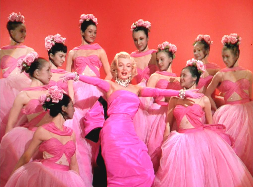
There are many other instances in popular culture when women and other marginalized groups utilized pink to gain attention and raise awareness. Marilyn Monroe in the 1953 film “Gentlemen Prefer Blondes” comes to mind—wrapped in her iconic pink dress as she told the world that diamonds are a girl’s best friend. Pink is also the color of the movement to raise awareness about breast cancer. And in 2016, Pantone named the dusty rose quartz color of the year. It was also called Millennial pink. Yes, millennials are deeply misunderstood and scapegoated for most of humanity’s problems, in my opinion.
Fluorescent pink

Before neon became the color of the ’80s aerobics revolution, it was the punk movement that first owned it a decade earlier. The bright and blinding colors added accents to the movement’s otherwise dark aesthetic. Prior to that, fluorescent colors were a favorite among advertisers and pop art, specifically for their attention-grabbing characteristics.
Today, fluorescent colors are relegated to highlighters. And it is no coincidence that pink is one of pen company Stabilo’s best-selling colors, alongside yellow.


