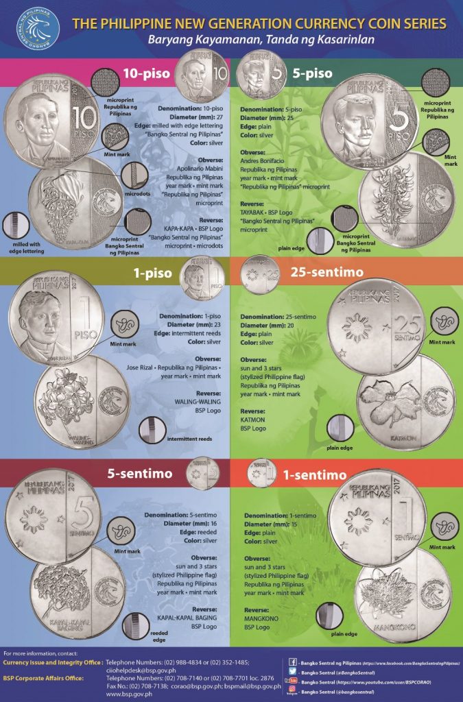
Bangko Sentral ng Pilipinas (BSP) recently released the designs of the New Generation Currency coin series, and unsurprisingly, many are enraged. They’re the opposite of practical—although they still vary in sizes, they now come in just one color and they all almost look the same. Check out BSP’s infographic here:

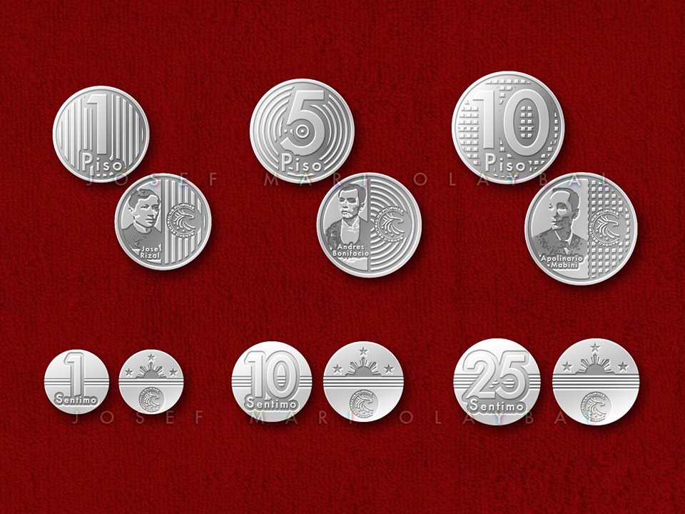
The issue has spurred discussions online as there are many sides to this story. Prompted by the new coin design apologists on comment sections of Facebook posts, an art director for a public relations company named Josef Mari Olaybal posted on his social media his own design of the new coin and I think the BSP could’ve thought of this as well:

Although the coins still share the same color (because some argued that mass-producing coins with different kinds of metals just for the sake of varied colors aren’t economical), they now sport easily recognizable and specific patterns on the surface of the metal, not just on the ridges.
“Napagawa dahil na-trigger akong makakitang may dume-defend pa sa Bangko Sentral ng Pilipinas, e kahit i-factor mo pa lahat ng economic constraints, magagawan pa rin naman ’yan ng paraan para maging significantly practically distinct from each other,” Olaybal writes in his post.
“Left out the flora-fauna because I don’t think anybody would feel any bit more nationalistic nor environmentally conscious from seeing that crap,” he also writes. But I disagree.
Nonetheless, if the BSP’s really minding the economics, they could’ve opted for a much utilitarian design.
Featured image courtesy of Josef Mari Olaybal
Read more:
These Filipina riders are changing the way we look at motorcycles
This Philippine drug war drama is coming to Netflix this April
Don’t get SOGIE? Check out this easy primer
Read more by Yazhmin Malajito:
Insulated bottles to keep your drinks cold this summer
You’re sabotaging yourself by procrastinating
No unli rice? Here’s how to cope
Writer: YAZHMIN MALAJITO


