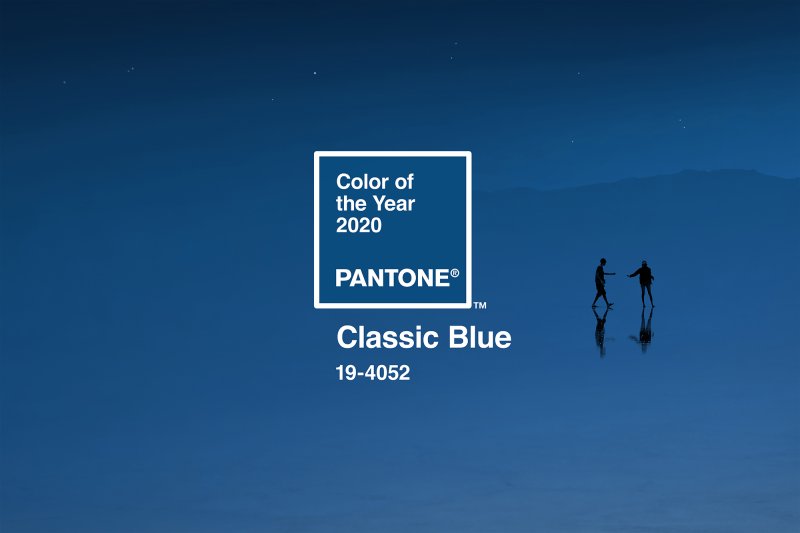
Unlike the previous years’ vibrant colors like Living Coral or Rose Quartz and Serenity, the Pantone Color Institute decided to go for the more toned down Classic Blue or PANTONE 19-4052 for its 2020 Color of the Year.

The decision was admittedly born out of the need for reassurance and a resilient outlook in these challenging times. As the decade comes to an end, the Institute made it a point to bring something familiar back, with Classic Blue reminiscent of how they started the decade with Cerulean Blue— a serene but vibrant kind of blue— to combat the anxieties of the Y2K era with excitement and optimism for what’s to come.
Classic Blue, however, is a deeper and a more muted tone that is both calming and easy to pick up by anyone. In an interview for Time Magazine, Pantone Color Institute Vice-president, Laurie Pressman, shares. “The sky at dusk–it’s not a midnight blue, it’s thoughtful, but it’s not so deep and mysterious … It speaks to our feelings of anticipation, when you think about the sky at dusk, the day isn’t over. You’re thinking, what’s ahead of us? It’s reassuring, but thought-provoking.”

Deriving from the interview, the simple and approachable kind of blue also subliminally promotes sustainability; not only can the color be seen as timeless and even genderless, but the color indigo can also be achieved naturally through plants and dyes. “We have all this focus on buy less, buy good, so people aren’t throwing things into a landfill,” Pressman said. “You read about buying things to last and this is a timeless blue shade. It’s always there and you’re comfortable with it, like blue jeans,” Pressman continues.
According to the color institute, the classic blue is a color that’s been “imprinted in our psyches as a restful color” all this time. It symbolizes a state of calm that we long to come back to during times of unrest—which means it should be no surprise that this kind of hue was the one that Pantone picked. It only makes sense that after 2019 Living Coral’s intense sunset comes the profoundness of the dusk.
Header photo courtesy of Pantone.com
Get more stories like this by subscribing to our weekly newsletter here.
Read more:
This restaurant’s menu has no text, only colors
The Nolisoli gift guide for artists and creatives
Your favorite Filipino childhood games inspired these colorful local designs
Writer: JOY THERESE GOMEZ